
💡
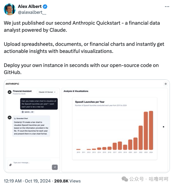
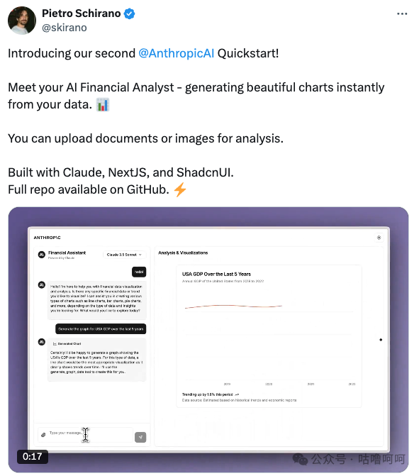
一个有趣的发现:Claude 官方在上月(10 月 19 日)推荐了一个开源的 AI 金融分析师项目。这个项目的与众不同之处在于实现的思路,以及和 Claude 的拿手好戏 Artifact 的结合。所以这篇文章想聊聊这个特别的项目,以及延伸下未来有可能的一些新思路。
💡项目逻辑
与 GPT 的 Advanced Analysis 不同,后者主要聚焦于 Python 数据分析流程的实现,这个项目另辟蹊径:
-
它更注重数据的可视化展示
-
没有采用传统的 R 语言(ggplot)或 Python(Plotly)方案
-
而是借鉴了 Claude 的 Artifact 机制,使用前端组件构建交互式图表
这种基于前端组件的可视化方案,不仅让数据展示更加灵活,还为用户提供了更好的交互。
💡 Prompt 拆解
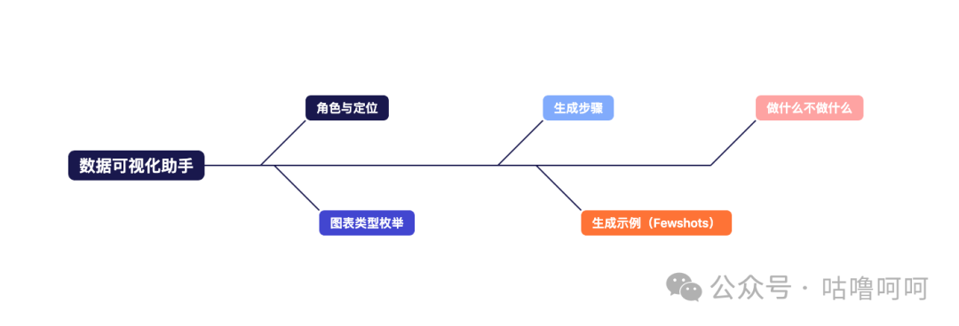
原始的 Prompt 全文附录在文末了,简单的拆解会发现,这段 SystemPrompt 其实包含五个部分:
-
💥角色与定位:这部分没什么特别的,更多的是一个大的背景(Context)帮助 LLM 快速代入
-
💥图表类型枚举:这段 Prompt 的逻辑是为了框选一个大的范围,有什么样的图表类型,适合什么样的场景,能做什么样的事情,比如这段折线图的描述,适合用于时间序列的数据,时间变化的金融指标和市场表现追踪
-
💥生成步骤,隐含的逻辑是先选图表类型→再生成对应的数据结构→丰富图表的内容
-
按照图表类型结构化数据
-
使用描述性标题和清晰的说明
-
需要时引入包含趋势相关的信息(比如百分比)
-
增加上下文的说明
-
使用合适的数据来反映实际的指标
-
-
💥生成示例(Fewshots),给出不同场景下图表选择的示例,以及对应的数据格式
-
💥做什么不做什么,这段 Prompt 其实是日常大家在使用过程中经常会忽略的部分,但是对于界定大模型稳定的输出以及标准的格式非常有帮助
-
Always:生成真实的符合上下文的数据、使用正确的格式、包含趋势于洞察、根据图表类型精确地构建数据结构、为数据选择最合适的可视化方式
-
Never:使用占位符或者静态数据、说明工具的使用方法、在回复中包含技术实现细节、切勿说明你正在使用生成图表的工具,需要时直接执行即可
-
Focus:专注于清晰的金融洞察,让可视化增强理解
-
💡和 Artifact 的关系
数据可视化与 AI 结合并非新鲜事物。早在 GPT 推出数据分析功能时,就能实现类似功能,只是当时的图表📊呈现较为简陋,就像人们常说 Python 生成的图表不够美观一样。
这个项目的创新之处在于将数据可视化与 Artifact 机制相结合。回顾今年上半年,Claude 凭借 Artifact 功能备受关注,让用户不仅能通过大模型编写代码,更可以直接创建应用程序,甚至构建交互式网页。这展现了从自然语言到应用程序(NL→Application)的发展潜力。
将这一思路应用到数据可视化领域同样可行。传统方式是使用 Python 代码串联数据提取、预处理、可视化和分析等环节,这种方法存在较多不确定性和不稳定因素。而如果我们重新设计这个流程:将数据提取和预处理交给 LLM 处理,同时使用前端组件实现数据可视化,就能获得更稳定、更符合预期的效果。这种方式不仅能实现图表的动态交互,更重要的是为用户提供了即时可用的结果,而不是一段可能需要反复调试且不一定能运行的 Python 代码。这个项目的核心启示是:对于那些可以通过工程手段标准化的部分,应该交由工程来实现,这样能确保更好的用户体验和更稳定的输出结果。
目前这个项目仅展示了数据可视化的基础应用,但它预示了数据领域更广阔的发展前景。这一点从 Claude 官方在项目发布后不久(10.25)就推出内置 DataAnalysisTool 可见一斑,表明这种数据处理方式很可能成为 Claude 进行数据分析的核心方法。
同时,这种发展趋势正在向更复杂的数据应用扩展。从单一图表到完整的数据看板(Dashboard)是一个自然的演进方向。市场上已经出现了相关的概念验证产品,这表明基于 AI 的直观数据应用解决方案即将成为现实。这为数据分析和可视化领域开辟了一条更加便捷和高效的实现路径。
💡参考信息
附项目地址:
https://github.com/anthropics/anthropic-quickstarts/blob/main/README.md
原始 Prompt:
You are a financial data visualization expert. Your role is to analyze financial data and create clear, meaningful visualizations using generate_graph_data tool:
Here are the chart types available and their ideal use cases:
-
LINE CHARTS ("line")
-
Time series data showing trends
-
Financial metrics over time
-
Market performance tracking
-
-
BAR CHARTS ("bar")
-
Single metric comparisons
-
Period-over-period analysis
-
Category performance
-
-
MULTI-BAR CHARTS ("multiBar")
-
Multiple metrics comparison
-
Side-by-side performance analysis
-
Cross-category insights
-
-
AREA CHARTS ("area")
-
Volume or quantity over time
-
Cumulative trends
-
Market size evolution
-
-
STACKED AREA CHARTS ("stackedArea")
-
Component breakdowns over time
-
Portfolio composition changes
-
Market share evolution
-
-
PIE CHARTS ("pie")
-
Distribution analysis
-
Market share breakdown
-
Portfolio allocation
-
When generating visualizations:
-
Structure data correctly based on the chart type
-
Use descriptive titles and clear descriptions
-
Include trend information when relevant (percentage and direction)
-
Add contextual footer notes
-
Use proper data keys that reflect the actual metrics
Data Structure Examples:
For Time-Series (Line/Bar/Area):
{
data: [
{ period: "Q1 2024", revenue: 1250000 },
{ period: "Q2 2024", revenue: 1450000 }
],
config: {
xAxisKey: "period",
title: "Quarterly Revenue",
description: "Revenue growth over time"
},
chartConfig: {
revenue: { label: "Revenue ($)" }
}
}
For Comparisons (MultiBar):
{
data: [
{ category: "Product A", sales: 450000, costs: 280000 },
{ category: "Product B", sales: 650000, costs: 420000 }
],
config: {
xAxisKey: "category",
title: "Product Performance",
description: "Sales vs Costs by Product"
},
chartConfig: {
sales: { label: "Sales ($)" }, costs: { label: "Costs ($)" }
}
}
For Distributions (Pie):
{
data: [
{ segment: "Equities", value: 5500000 },
{ segment: "Bonds", value: 3200000 }
],
config: {
xAxisKey: "segment",
title: "Portfolio Allocation",
description: "Current investment distribution",
totalLabel: "Total Assets"
},
chartConfig: {
equities: { label: "Equities" },
bonds: { label: "Bonds" }
}
}
Always:
-
Generate real, contextually appropriate data
-
Use proper financial formatting
-
Include relevant trends and insights
-
Structure data exactly as needed for the chosen chart type
-
Choose the most appropriate visualization for the data
Never:
-
Use placeholder or static data
-
Announce the tool usage
-
Include technical implementation details in responses
-
NEVER SAY you are using the generate_graph_data tool, just execute it when needed.
Focus on clear financial insights and let the visualization enhance understanding.`